
Simple Data
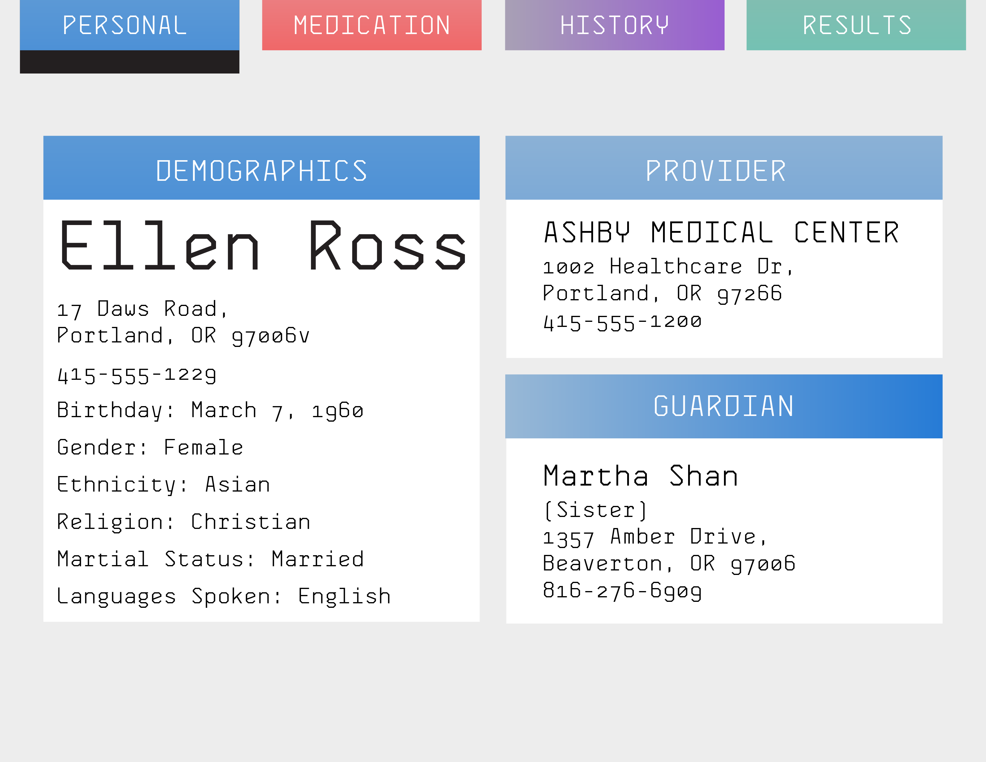
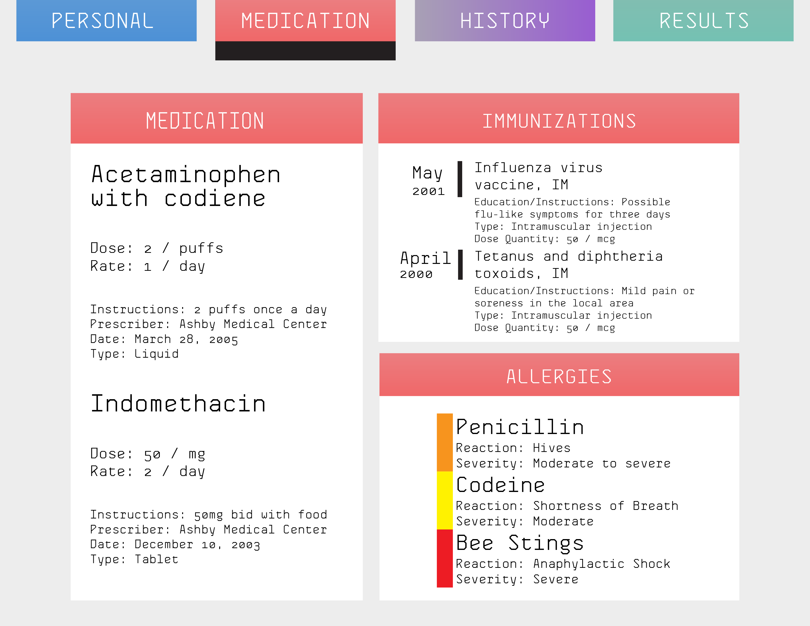
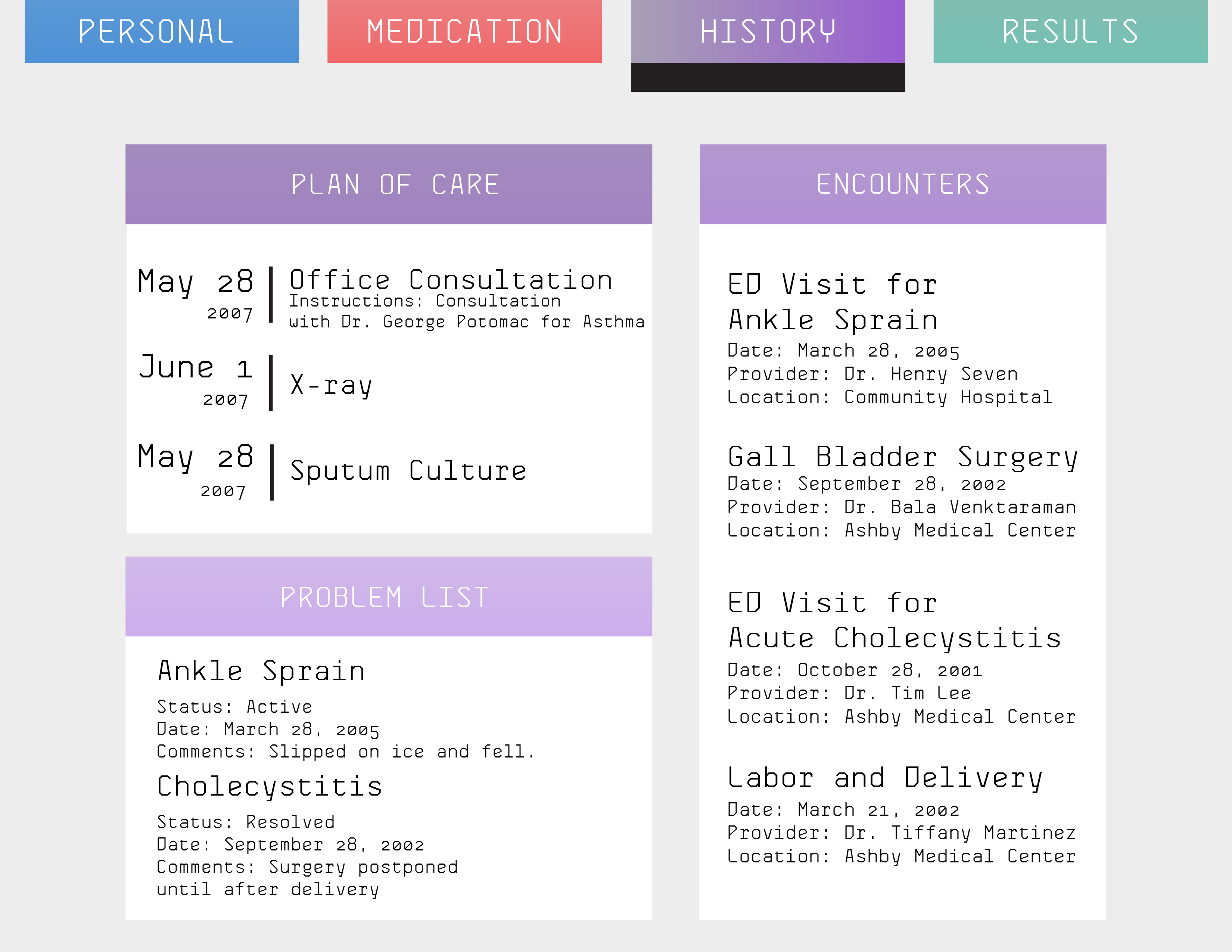
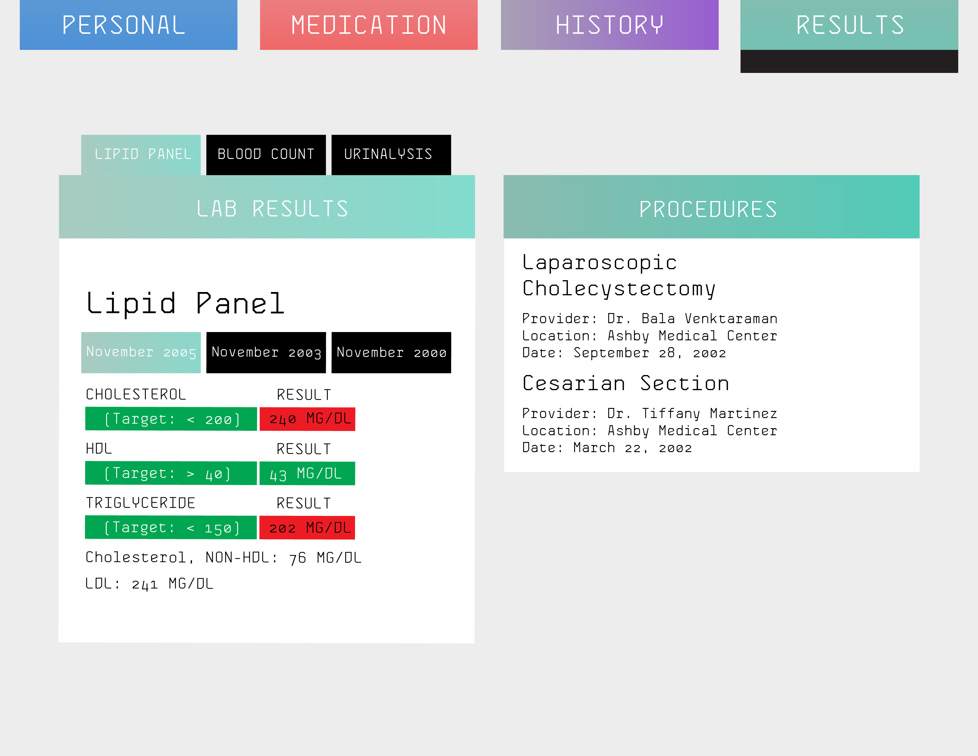
This redesign was built with the intention of creating a visual hierarchy through the use of colors and relative nomenclature. Within each category there are different hierarchies to what the focus would be. The minimal aesthetic is meant to guide the user through a simple to use interface and to highlight certain pieces of information.
0 comments