
Clean, Clear, and Fresh Personal Health Record
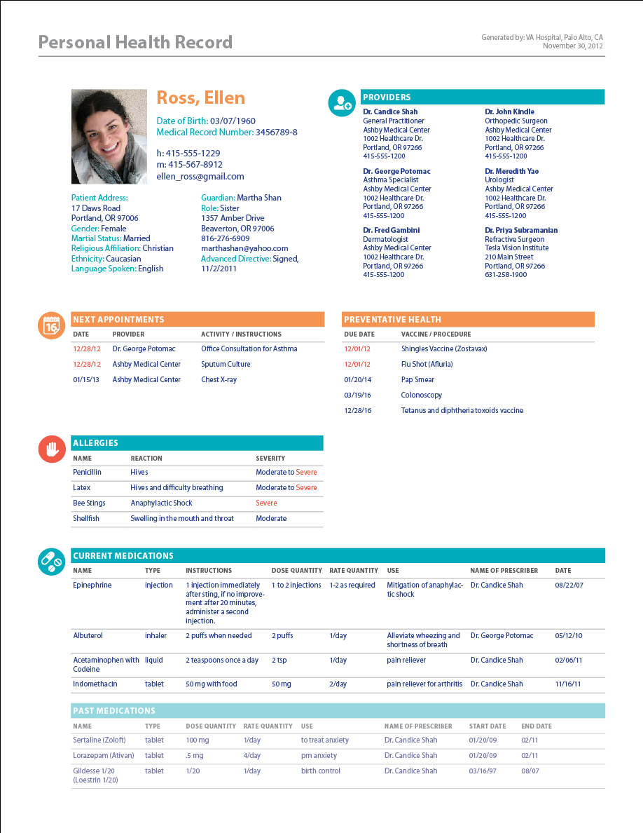
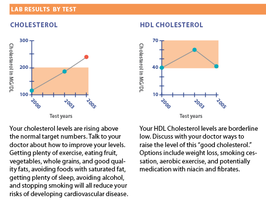
Using icons and clear typography, our re-designed layout of the Personal Health Record is functional and appealing to the full range of users. The design utilizes distinct modules to define specific sets of information for a quick read. The first module contains the most important information in case of emergency. The second module summarizes the patient’s complete histories. The third module summarizes lab results in both list form and graphically to ensure that the patient can more clearly understand their results.
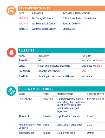
Our goal is to make the patient’s medical record easy to read by the patient, his caregivers, and his healthcare providers. Key information is located towards the top of the record. Patients and their caregivers can easily see the patient’s “to do” list of upcoming appointments and preventative tests under the orange bar. Patients can easily find the doctors' phone numbers and addresses before their appointment. The patient can also verify that the medical record is updated with their latest address and phone numbers.
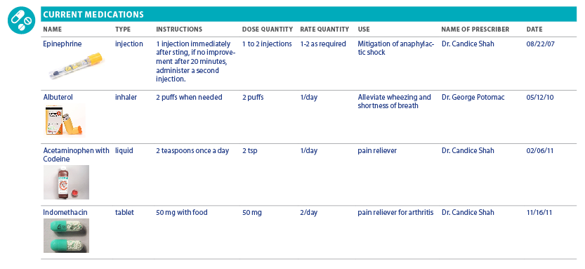
With our re-designed medical record, doctors and emergency room staff can easily find patients' most vital information including allergies, medications, advanced directive, guardian. Additionally, this layout makes it clear for the E.R. to contact the appropriate physician for the patient for hospital admission or for outpatient follow up.
We took on this project because we enjoy a good challenge and we felt that by pooling our expertise as a team, we could potentially help a large number of people. Heather is an independent graphic designer who worked for seven years at Apple Computer on their simple yet powerful graphic campaigns. Ruth is a physician who has a special interest in patient engagement and who enjoys beautiful design.
0 comments