
Moxie Method
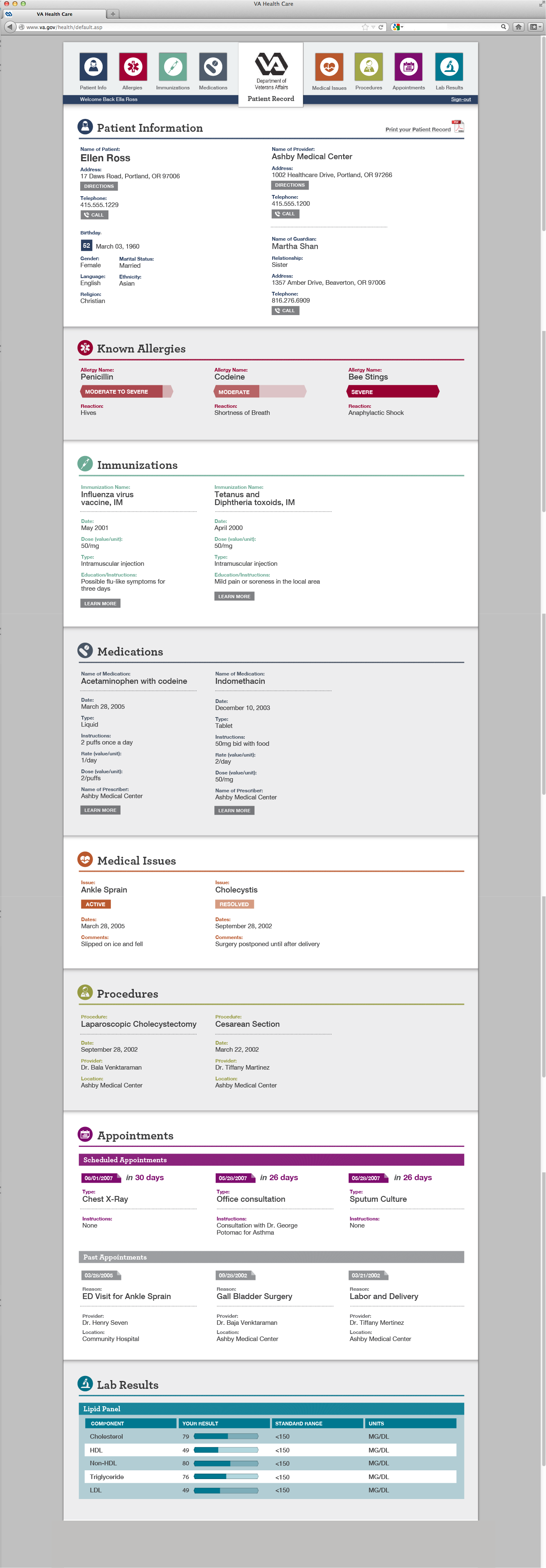
We focused at making the form optimally usable (hierarchy, font, colors, iconography, interaction) by the patient, the guardian and the physician. We created a Print form and a Web version of the form.
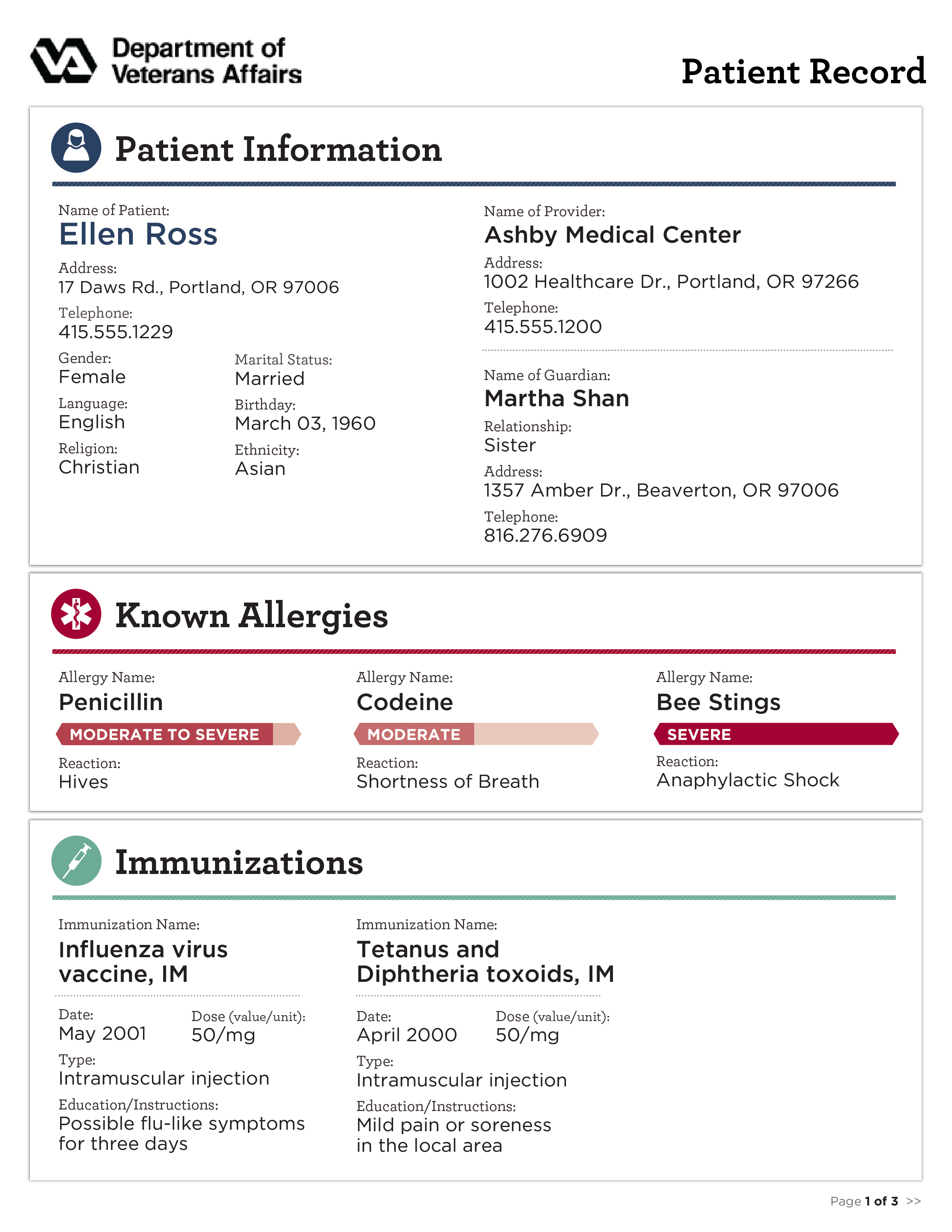
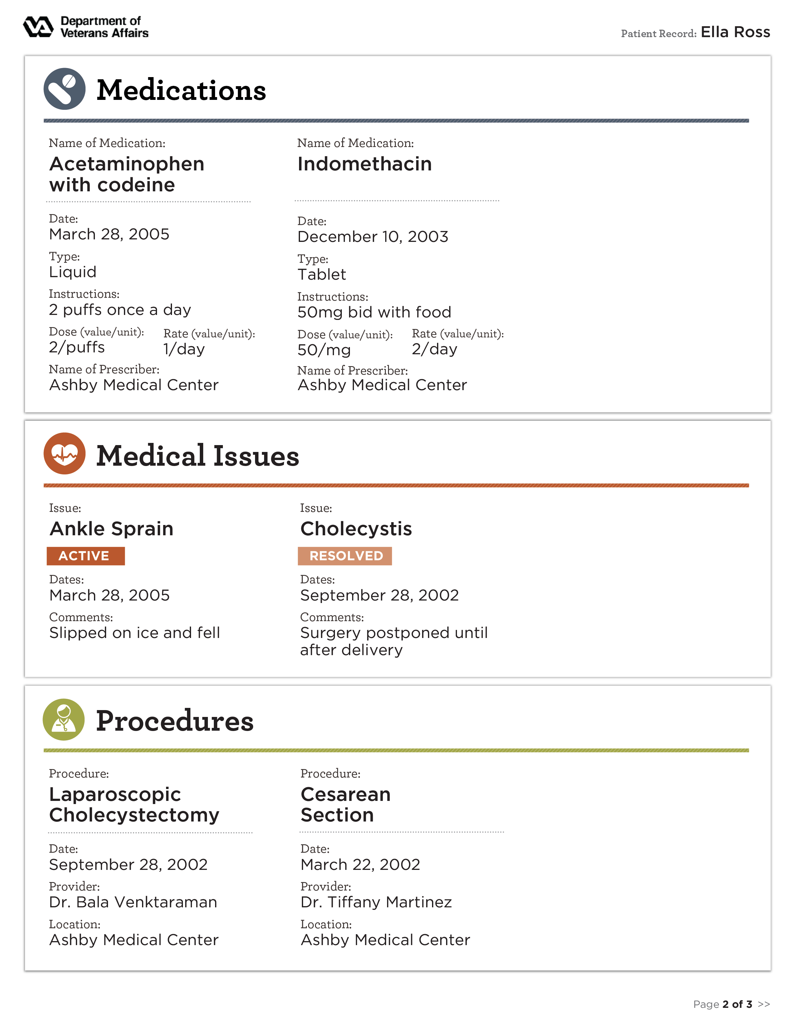
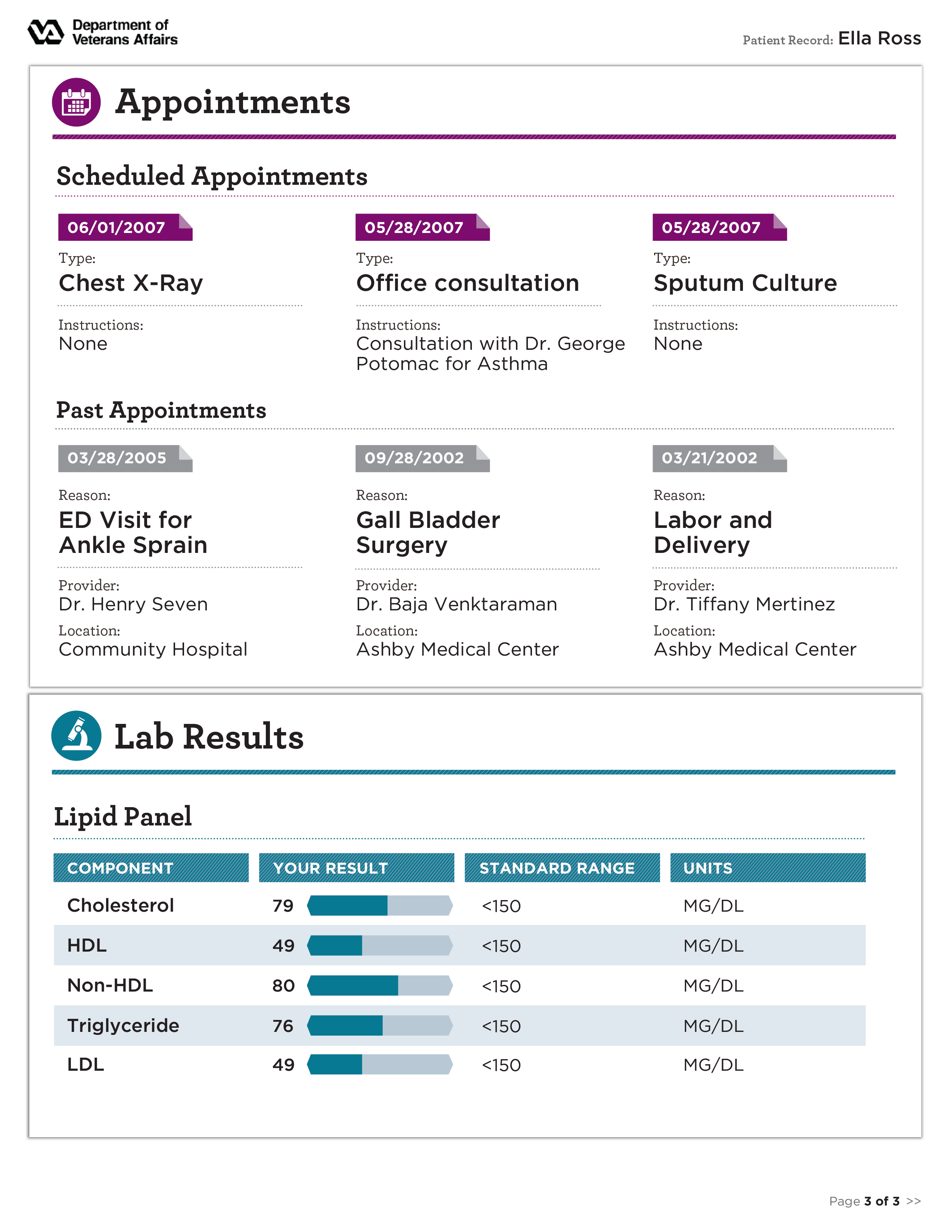
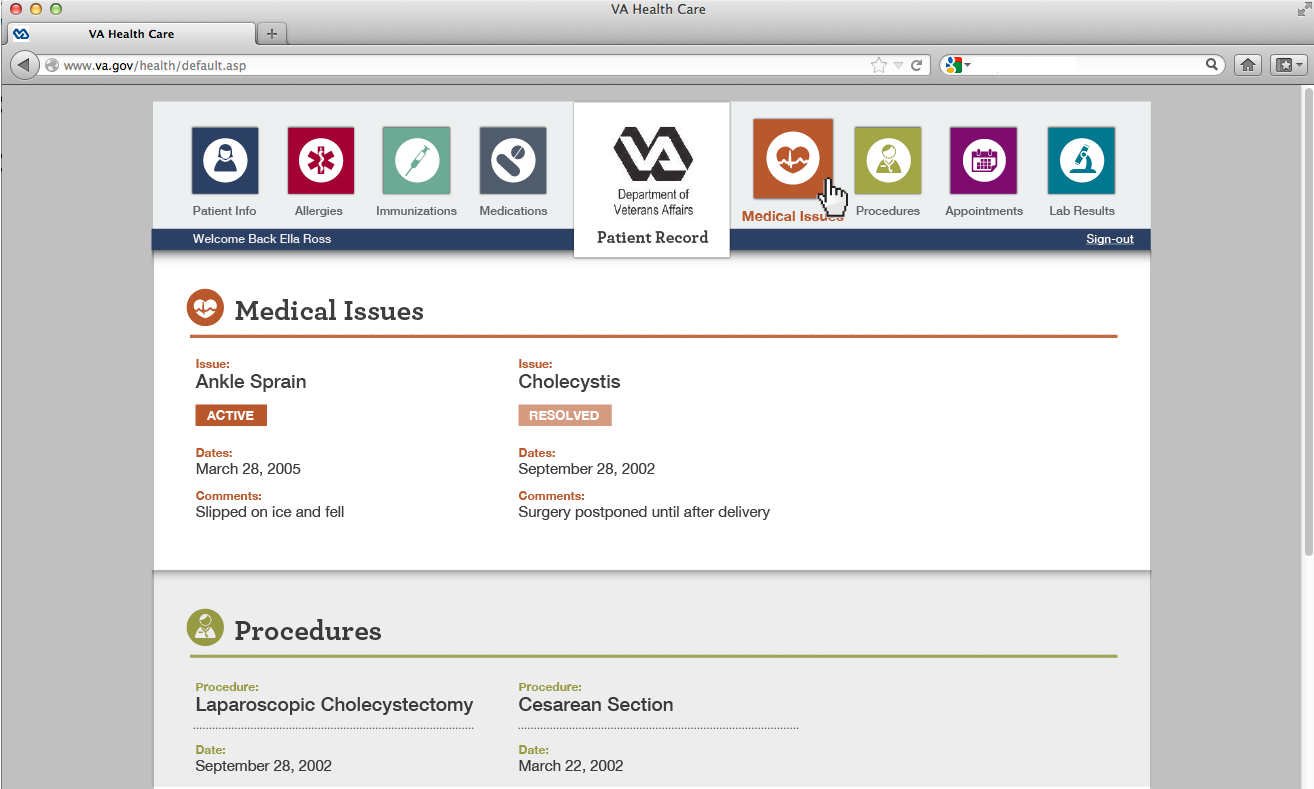
For the print form - we made sure things that matter more - are more visible, that call to actions are highlighted, that sections are in an order that make sense, and icons and infographics are leveraged for quick review and digestion of information.
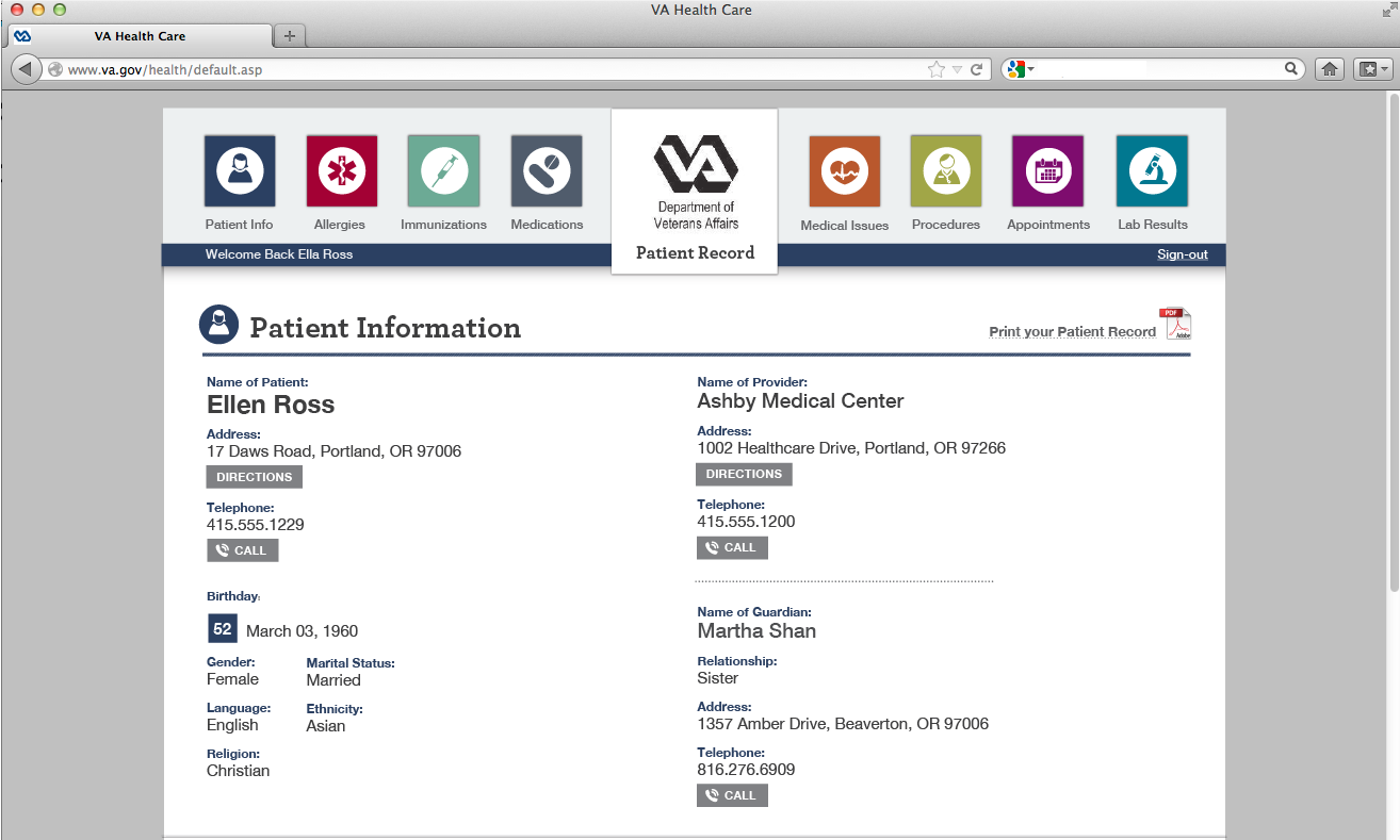
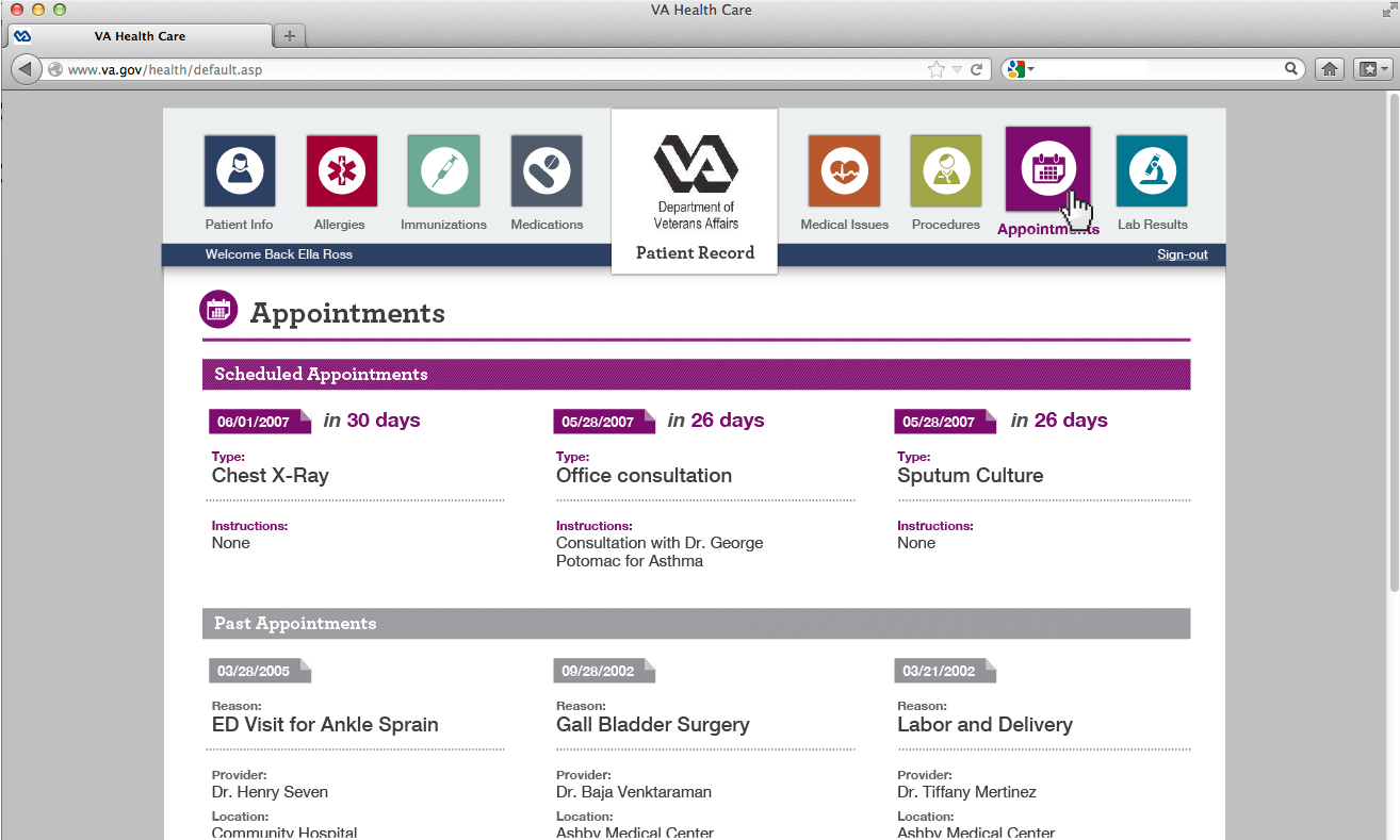
In addition, for the Web we added some interactive buttons and functionality to make it even more useful; For example - an age can be calculated based on a birthday date, directions can be provided based on an address, and days left for an appointment can be presented (rather than just a date). Finally, a permanent top navigation bar allows users to click on any of the sections and have the page scroll to that area on the page, or simply scroll through the page as if it is a long printed document. Again - thinking about useful yet easy user experience.
We also tweaked the language a bit to be more target-friendly.
Thank you. Omer Malchin Moxie 650 799 4745
1 comment
Omer Malchin • over 13 years ago
This is the submission by Moxie (http://moxiemethod.com) - for a print and a Web version of the Veterans Affairs form.