
Med21
This entry, titled "Med21," was designed with both the patient and provider in mind.
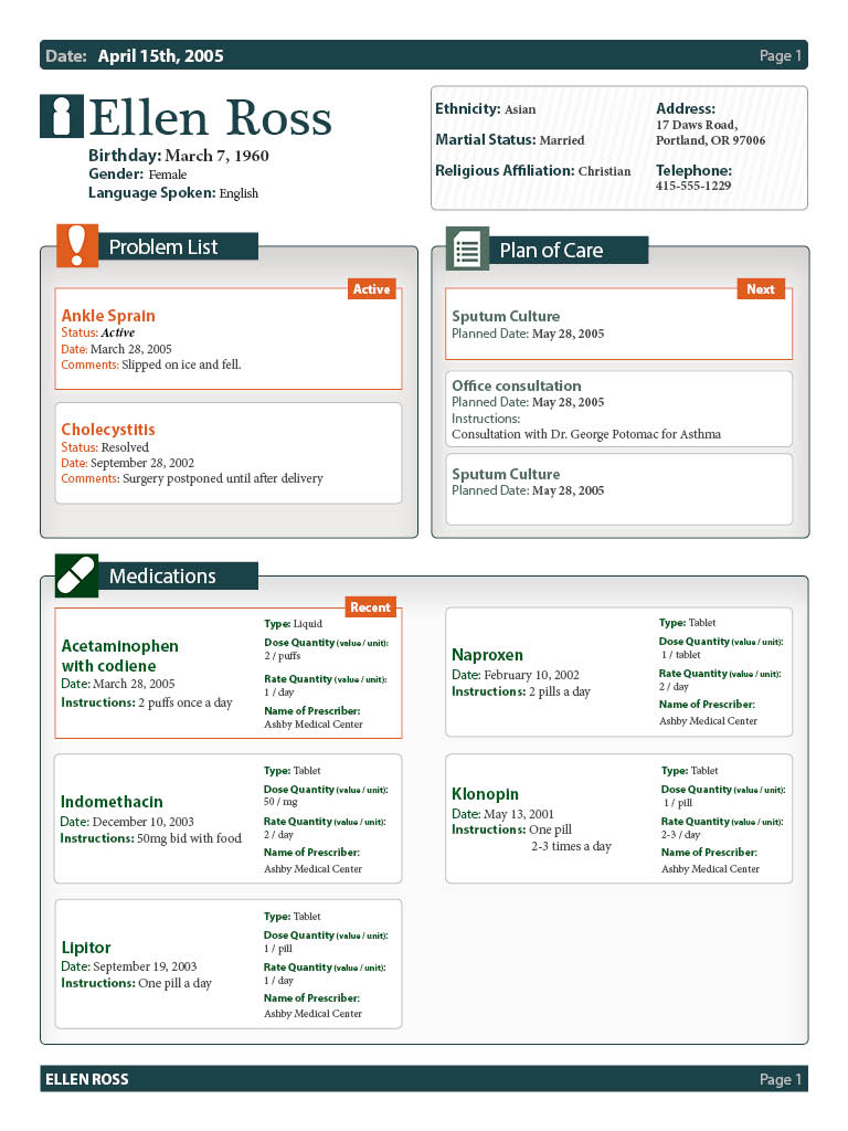
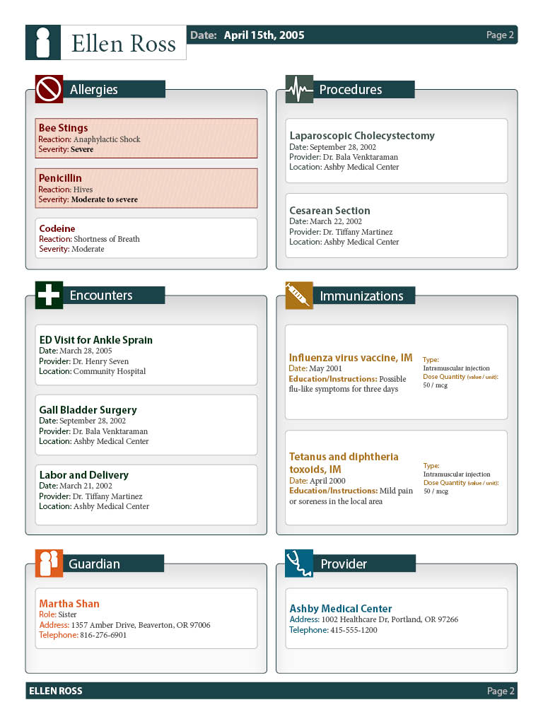
This design uses icons, color, size, typography, and shape to display information in a quick-to-digest way. The document was built using responsive design principals. If one section has more information than most, it can easily become a full-width column to accommodate the information. The medication section is a good example of this type of responsiveness.
Icons and the vertical arrangement of information are loosely mirrored on social media, creating a sense of continuity for patients who may be unfamiliar with medical information or who are unable to read easily.
To aid providers, sections are placed on the document in order of importance from a provider perspective, so that practitioners can find critical information efficiently.
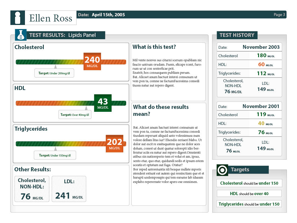
The lab results page gives a simple, easy-to-understand graphic representation of the results. Important results are highlighted, and additional results are designed to be present without being distracting. Once again, the use of color, shape, icons, and typography all contribute to making the document efficient to use.
0 comments