
A Pragmatic PHR
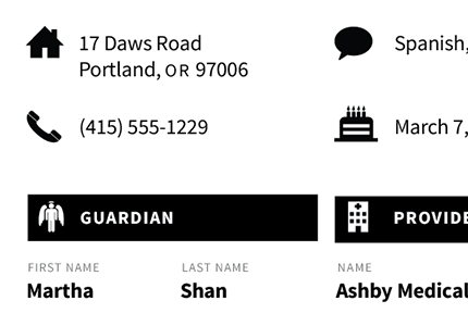
This is a practical take on PHR. It utilizes a greyscale palette in order to be most economical in printing and copying, especially for lower-income patients. All icons come from the Noun Project in an attempt to use the most common visual languages for a wider variety of interpretation across audiences. The typography is set solely in Adobe's Source Sans Pro, a typeface designed to be 1) open source and 2) specifically legible at both large and small sizes and across short and long passages of text.
0 comments