
Labels. Buckets, and Icons
Using input from patient and physician interviews, our team created a design that aims to work well for physicians, patients, and guardians.
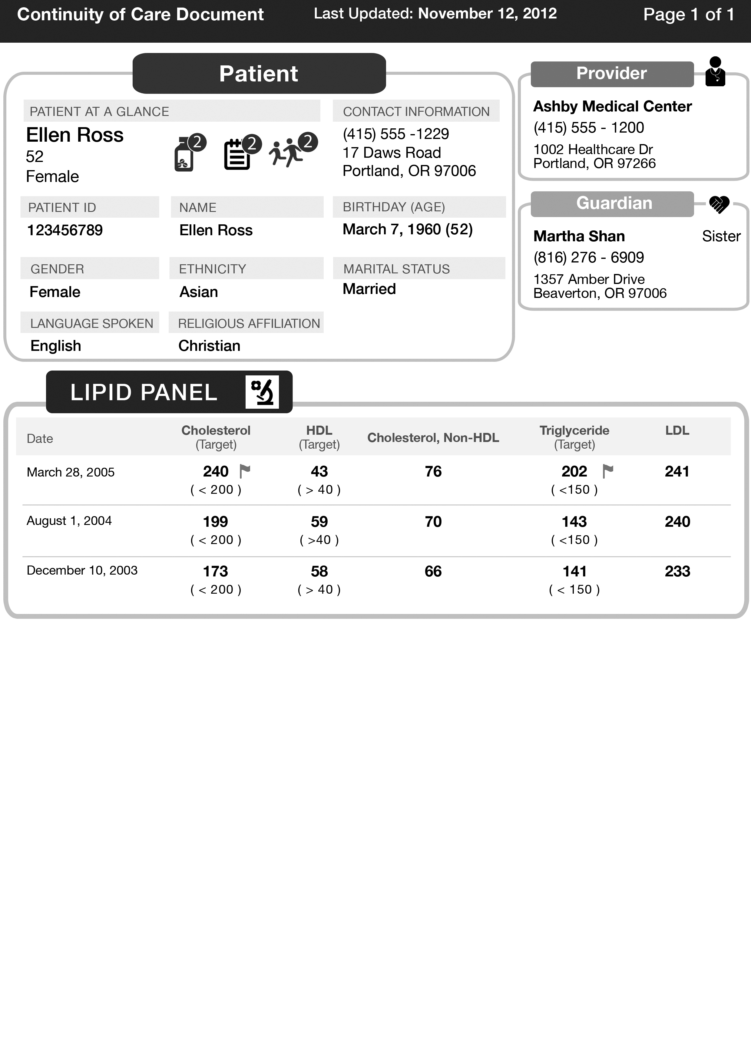
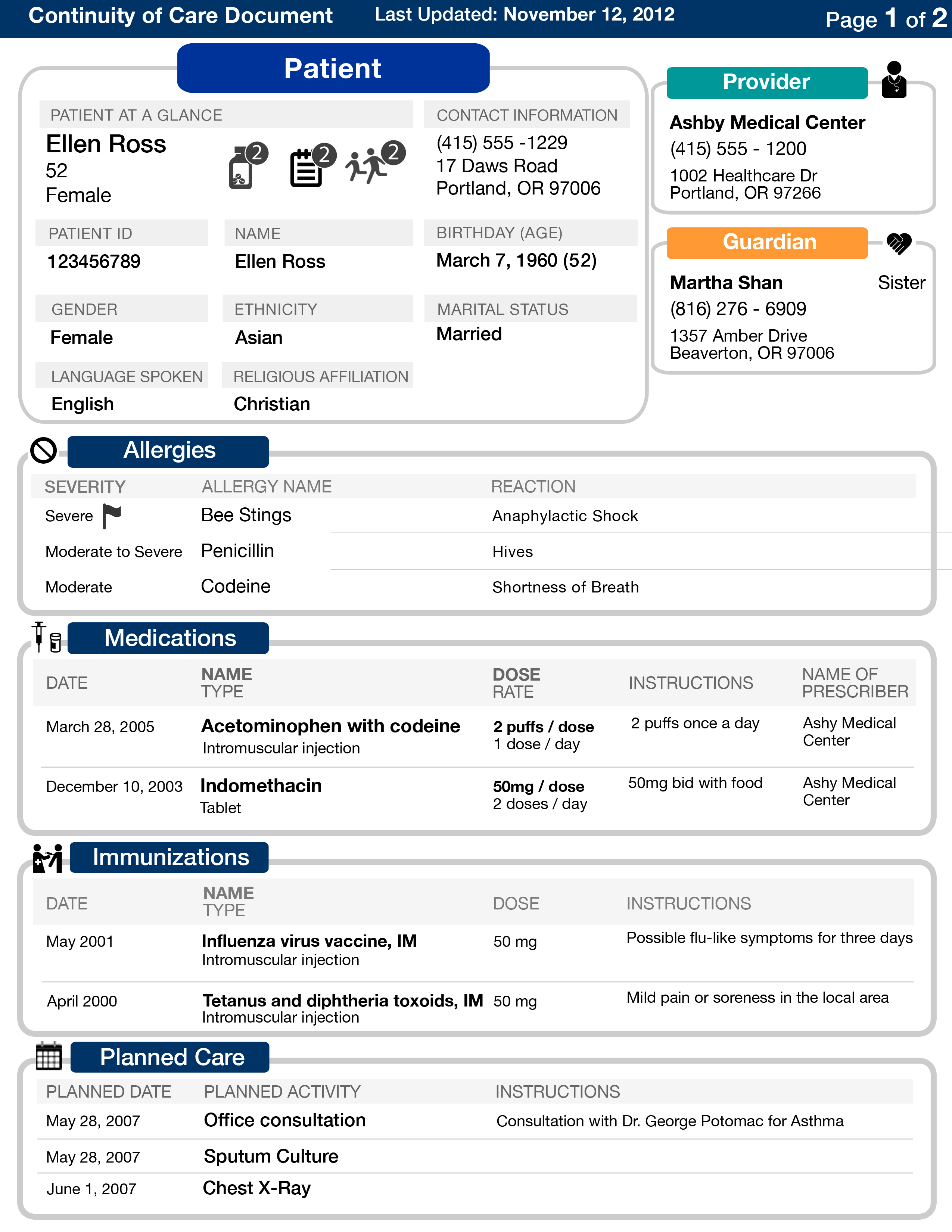
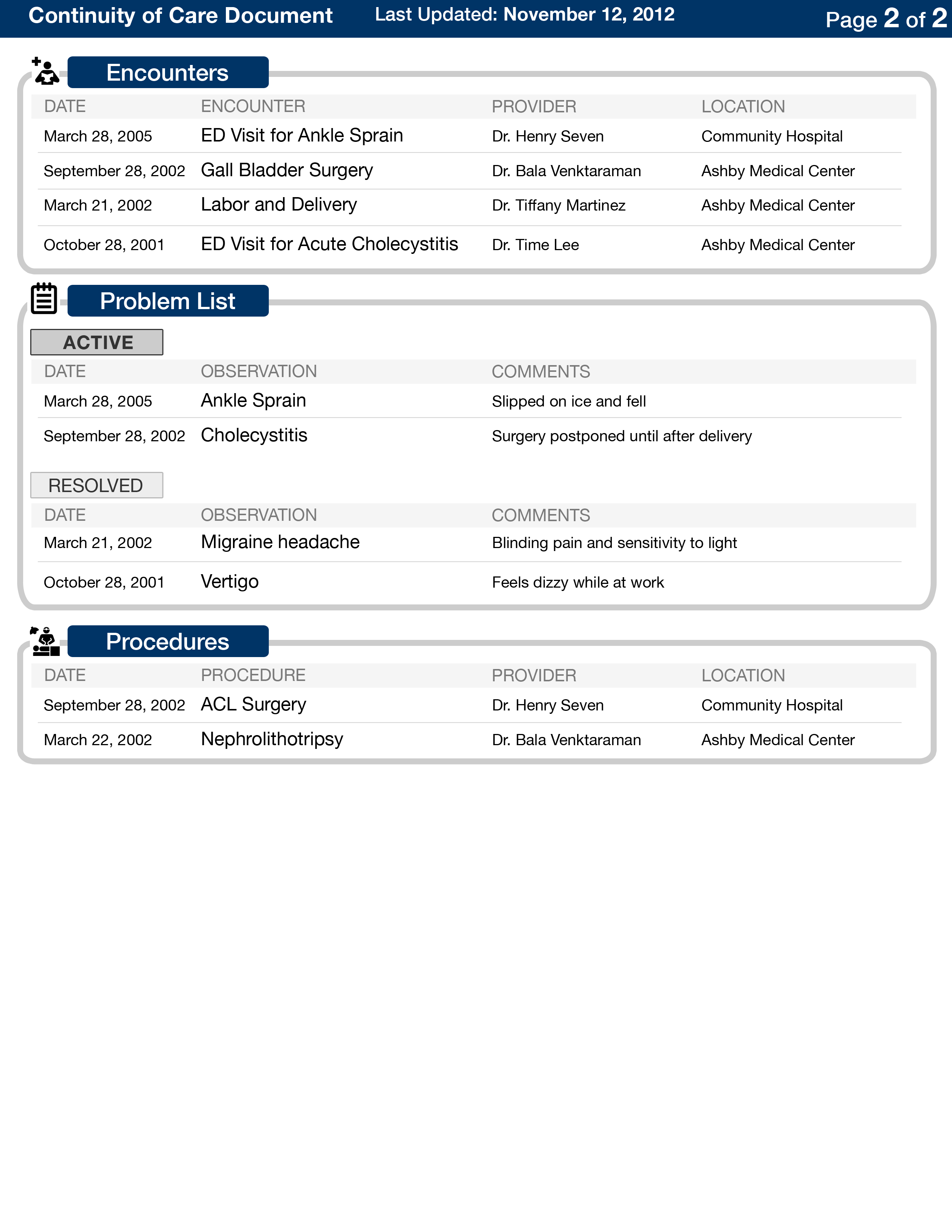
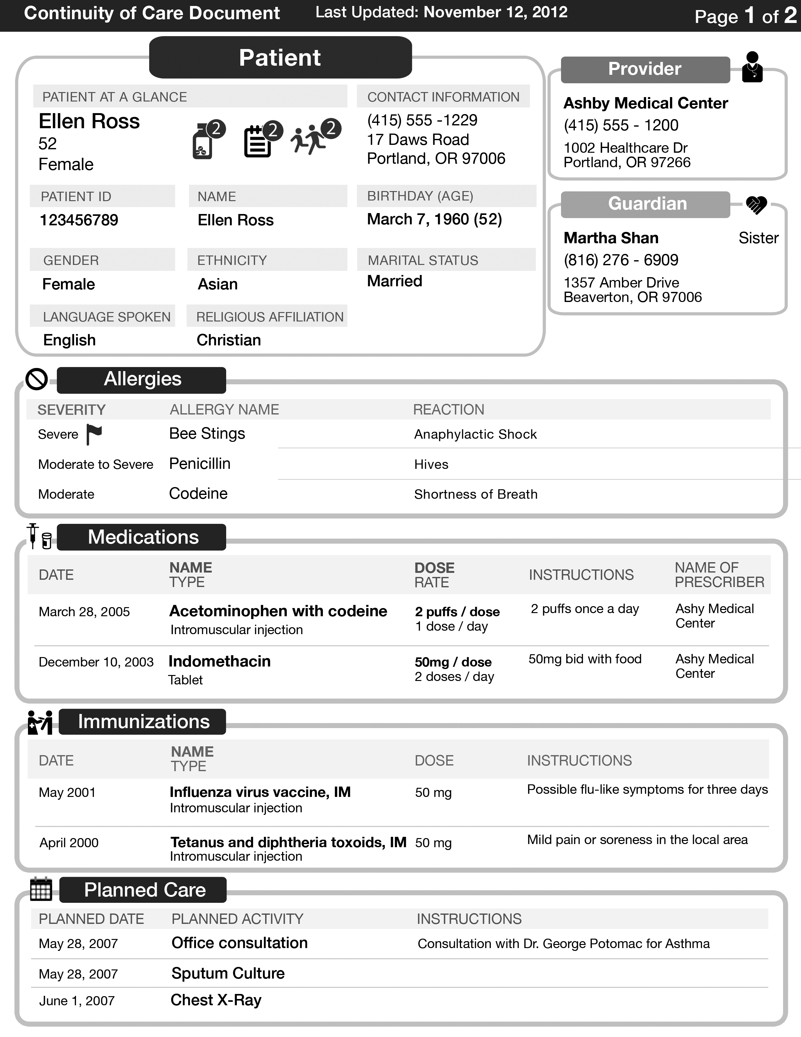
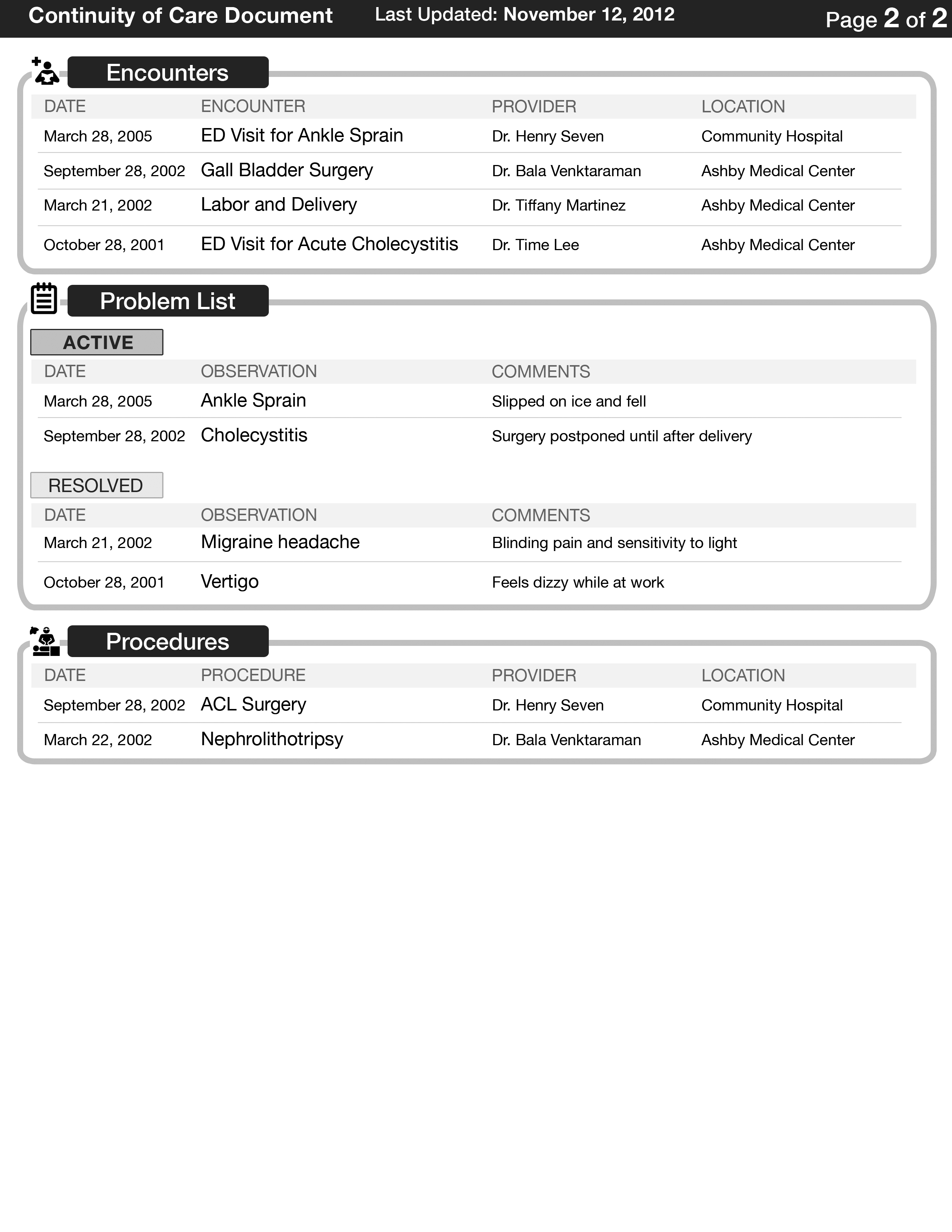
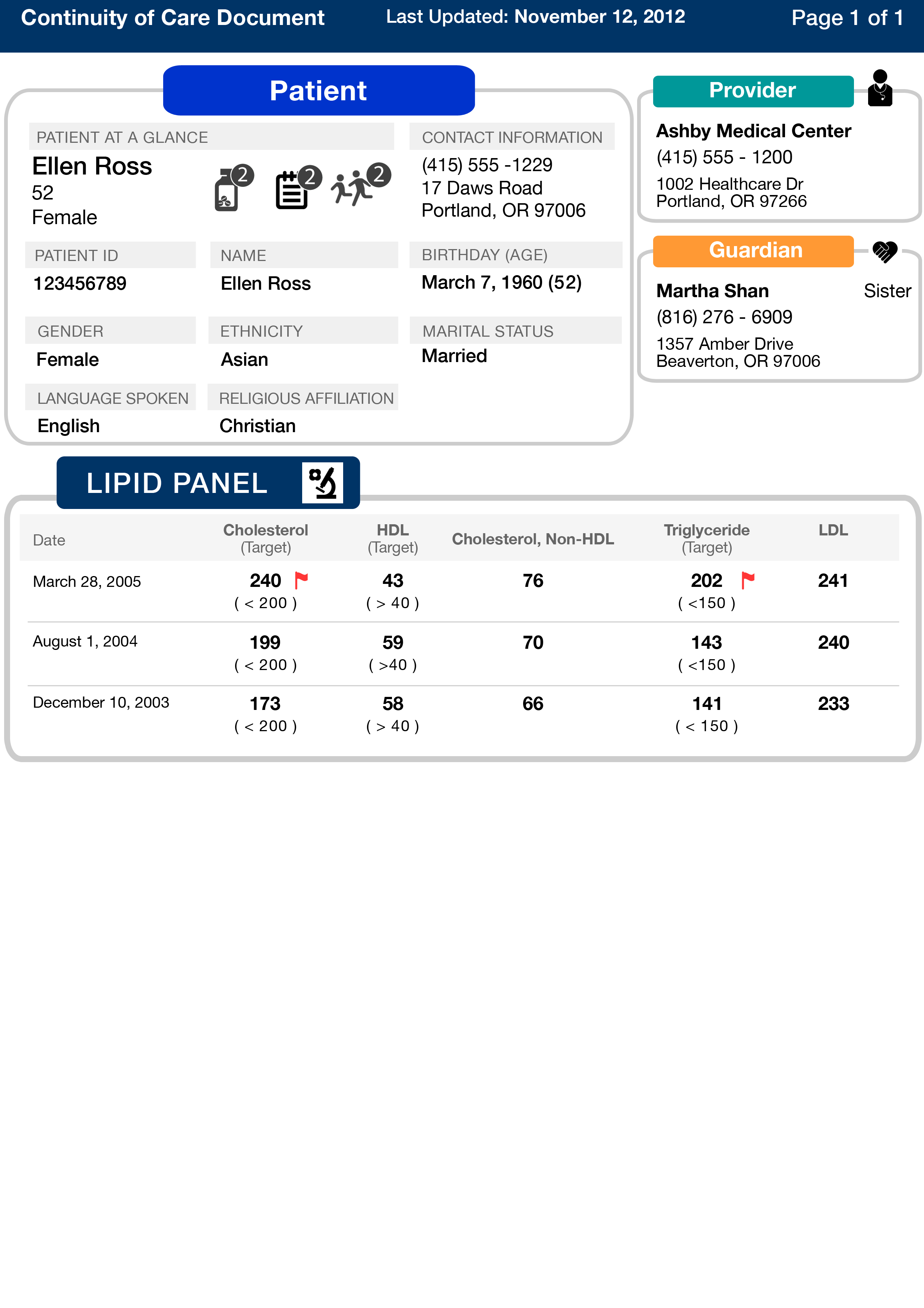
First, we divided the medical record into 3 major sections: patient demographics, provider and guardian information, and patient medical history. We used colors that printed well in grayscale to differentiate the sections. In the patient information section, for example, we created a quick summary with the most important details, and icons that denote the number of medications, active problem lists, and number of children.
We carefully analyzed how patients and providers organize and process information on the medical record, and organized the information in each section accordingly. Allergies and medications were deemed most important, and the first thing that physicians look at when seeing a patient. We also used icons mostly for non-English speaking speakers, but also for English-speaking users who wanted to navigate quickly to a section.
Within each section, we knew that date is almost always the most important sorting parameter, followed by the name. Thus, most of our information is sorted by date and name. For certain sections, we used flags to bring attention to special situations, such as a severe allergy or a lab result that was out of the normal range.
For the layout, we wanted to put each section into its own compartment, and overall, we instituted a grid-layout so that it reads easily. Within each section, we generally used a table-format because the information is extremely dynamic, and having a table format was the most versatile use of space. For example, it would work well for patients with either three of two dozen medications, for example. It also made it easy for all users to spot trends in data values.
Finally, we decided a size 10 font for the details was the smallest font we could use. It allowed us economic use of the space, but also allow people with poor eyesight to read easily.
0 comments