
A Human-Centered Approach to Healthcare
CHALLENGE: The current plain-text Blue Button medical file is problematic. Patient content is dense, unintelligible and visually dry. This is a disservice to users who may have low health literacy, seniors, and non-native English speakers. The standard document may be functional, but provides poor user experience.
SOLUTION:
The problem being solved is a fresh human-centered reinterpretation of medical records. By designing for people, an improved medical file becomes an empowering tool for health management and communication.
The benefactors are patients, their families, and caretakers.
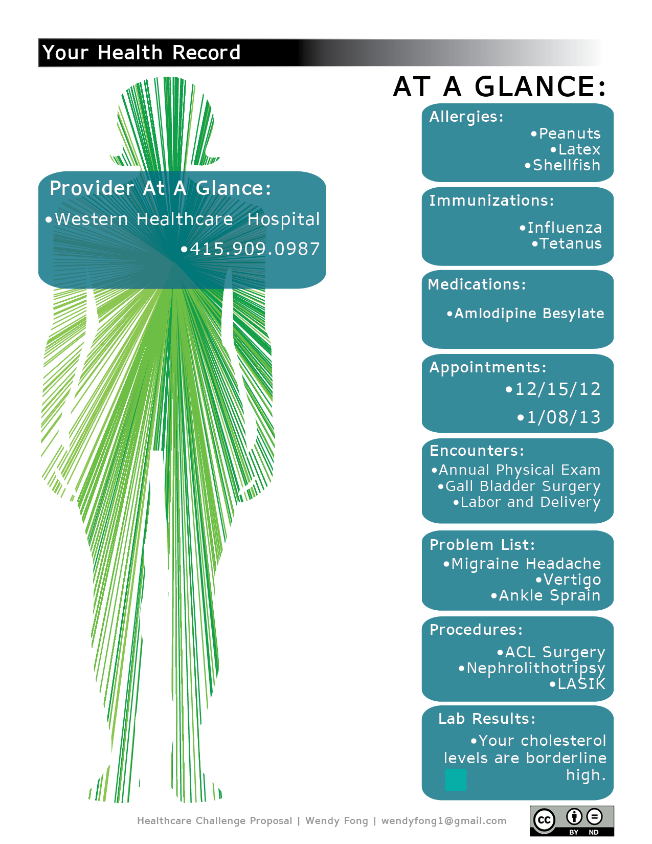
CONSIDERATIONS INCLUDED IN THIS PROPOSAL:
•Clear visual hierarchy that distinguishes CCD fields using distinct header levels and bold colors.
•Use of the typeface APHont. Developed by the American Printing House for the Blind (APH), Aphont is designed to be used by readers with vision problems. The typeface has consistent stroke widths, pronounced ascenders and descenders, and wider horizontal proportions.
•Use of information graphics to simplify health actions, such as medication reminders and upcoming calendar appointments.
•Humanizing the patient-provider relationship, such as displaying a photo of a patient’s primary doctor.
•“At a Glance” highlight for family members and caretakers to easily locate important patient information.
•Accessibility needs, such as provider maps, transportation options, and courtesy reminders.
FUTURE (MOBILE, ONLINE) ITERATIONS INCLUDE:
•Interactive elements: page translation, links to medical support research and information and healthy lifestyle management suggestions.
0 comments