
HEVA [Health Essentials for Veteran Americans]
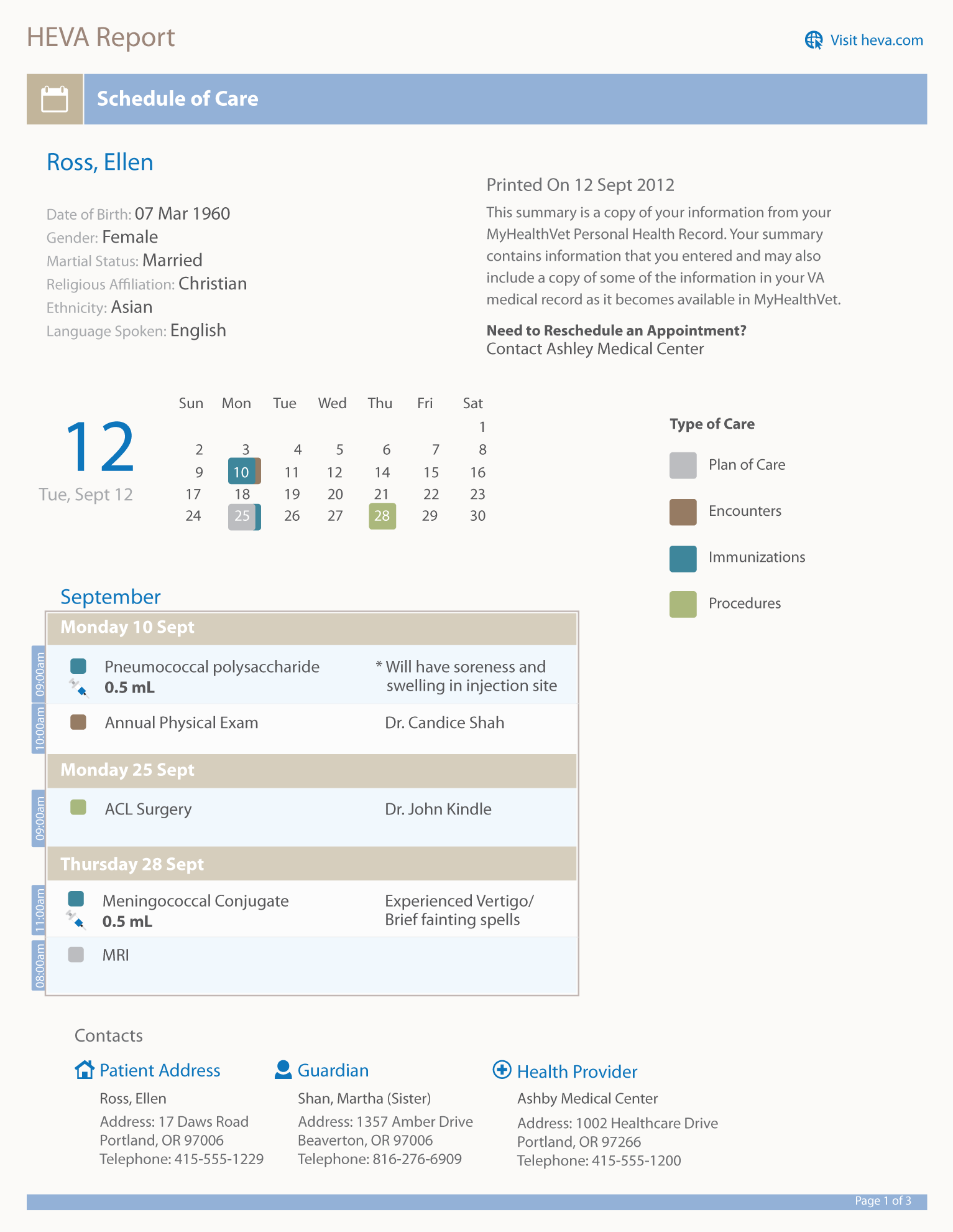
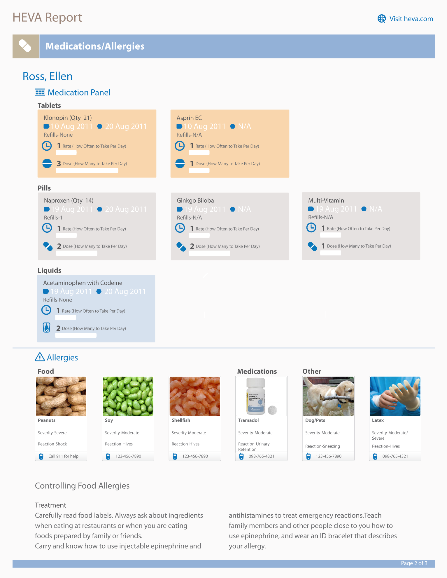
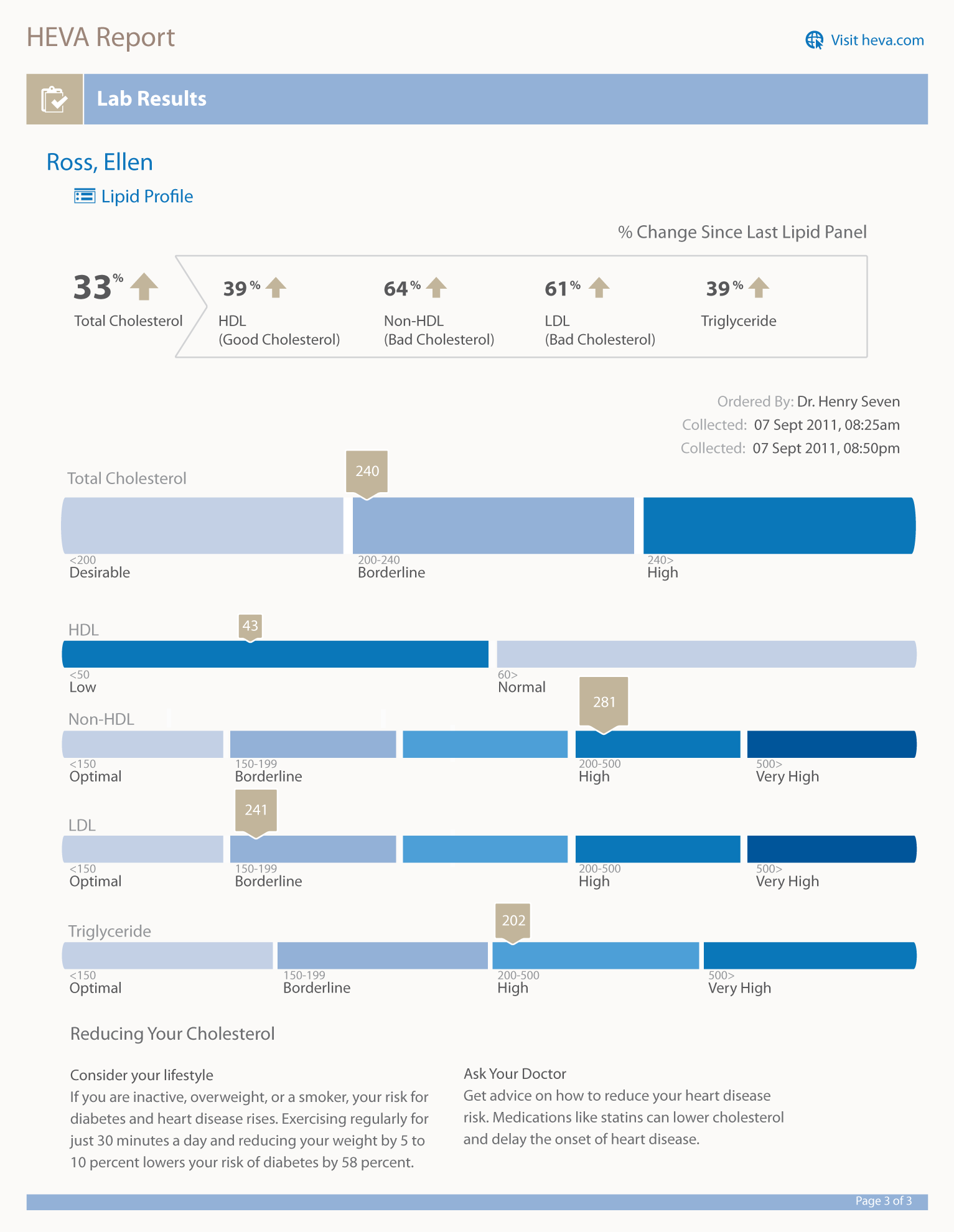
My final design illustrates a scenario where the patient is returning to the VA for a follow up consultation and is provided their lab results from the previous visit, a list of new medications, and a schedule of upcoming appointments. For this scenario, I have divided the report into three primary sections- 1) Schedule of Care, 2) Medications/Allergies, 3) Lab Results.
For the website, I envision a way for users (patients, caregivers, guardians) to select and print what they need at any given moment. For this reason, I initially explored a direction where each section above could be a stand alone document. The page would be divided into three parts- 1) User demographics at top, 2) Charts or medical data in the middle, and 3) Contacts at the bottom. The thought was that the information on the top (user demographics) and the bottom (contacts) must be constant as some users may only want to print out the Medications page, for instance. Therefore, they would need to have important patient data and contact information on each page.
Considering that caregivers and patients at VA's are experiencing the following challenges : (1)pharmacists at VA's are forced to memorize multiple input commands on a 30+ year old system that still uses a command-line interface and (2) patients have to shift through a sea of information to make sense of their records; I am proud to have participated in this challenge to transform the usability of critical patient information. It is gratifying to think that this kind of delivery can enhance the effectiveness of our health care personnel and ultimately the lives of military service men and women.
0 comments