
Medical Makeover
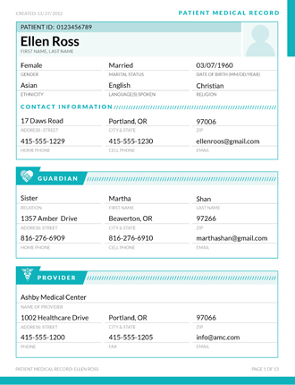
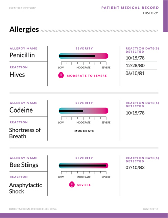
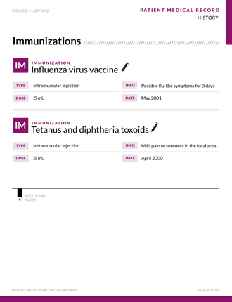
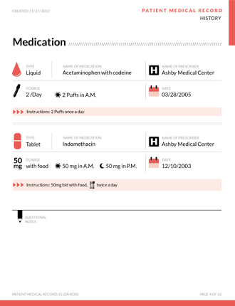
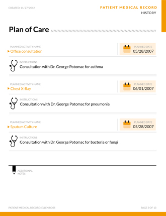
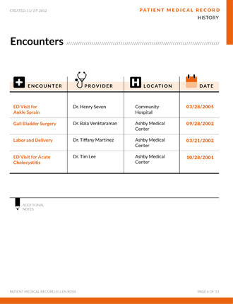
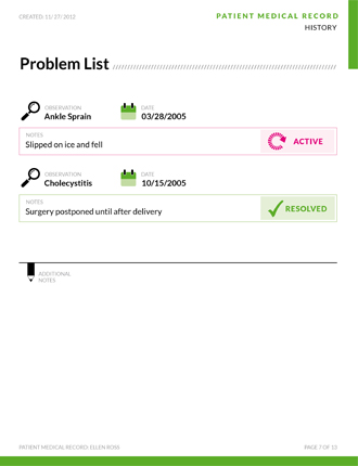
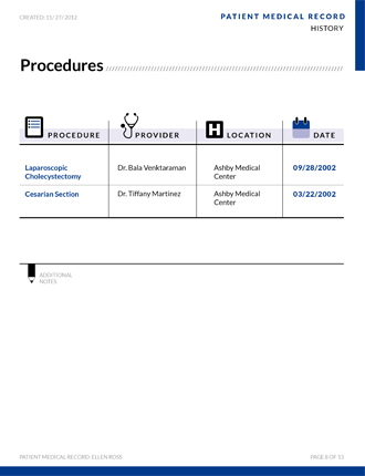
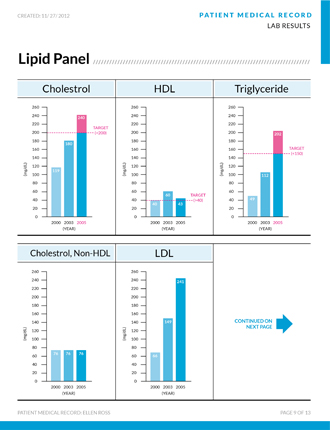
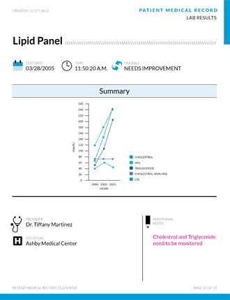
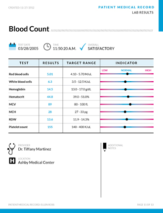
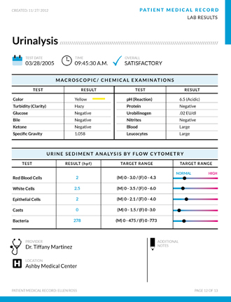
My approach for this design was to be clean, simple, organized, and consistent. Patient medical records should be easy on the eyes, and not so daunting. I've tried to incorporate as much icons and charts as possible to keep it from looking like a thesis paper. I've chosen a clean, and simple sans-serif font and just kept everything unified by using it throughout the design. I've also created a template for the header and footer of each page and gave a color for each specific section, that way it's easier to spot the page(s) you are looking for. Also, each section has its own page. This layout can also be easily implemented into a web site. Ultimately I want people to feel comfortable reading their medical documents, and in return feel more positive about their health. Our health is number one, and it's important that we understand the documents, so that we can move forward and make the necessary changes for a better, healthier lifestyle.
0 comments