
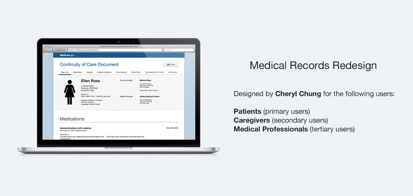
Information-centric record redesign
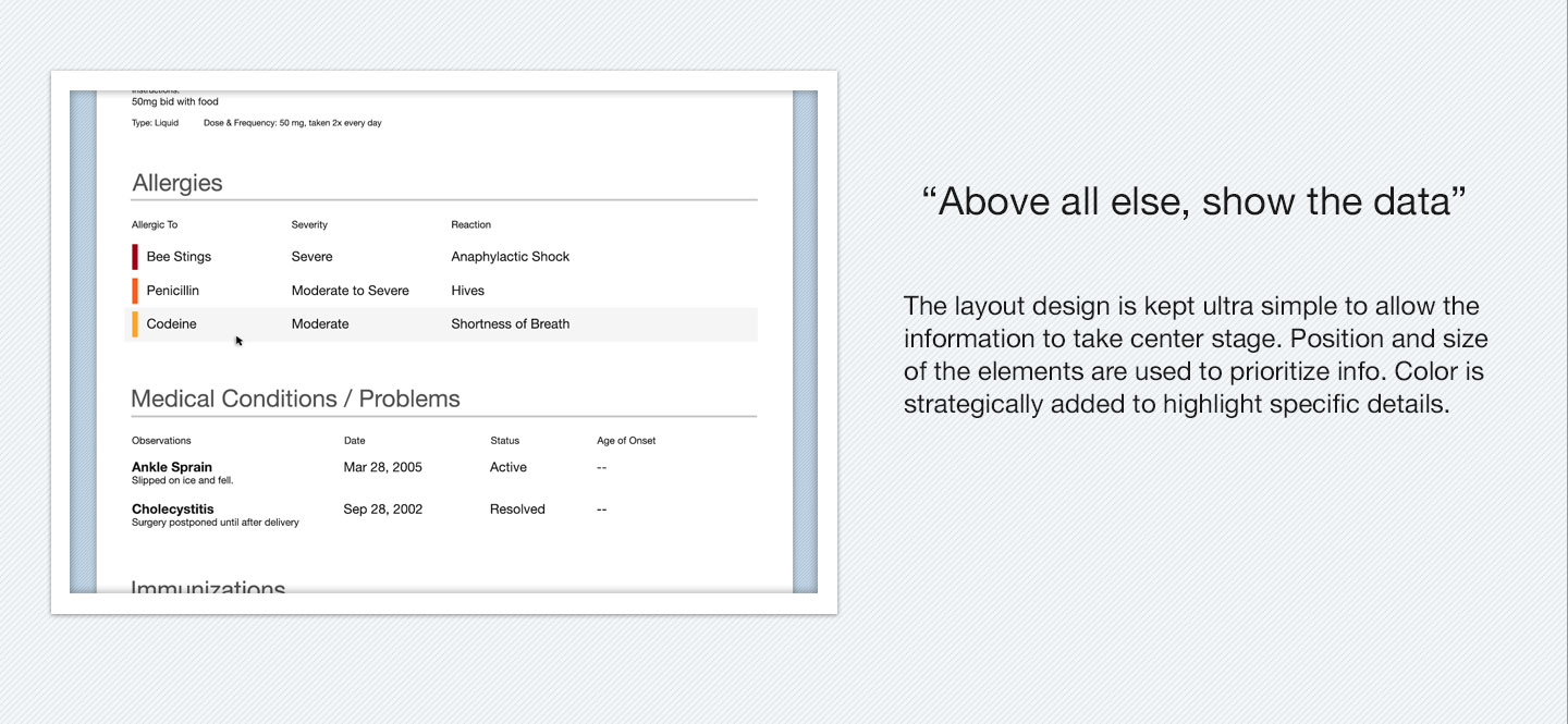
"Above all else show the data."
- Edward Tufte, statistician and information designer
This is a usability-focused design where the layout is kept ultra simple so the content, and not visual aesthetics, is viewed front and center. The main goal is to allow users to find what they need as efficiently as possible and easily comprehend it. To accomplish this, everything is prioritized and grouped based on relevance and importance. Color is strategically added to highlight specific details.
Several requirements has been identified for our three user groups:
For Patient (primary)
Goal: To better understand their current health status, medicines they should be taking, and things they can do to maintain/improve their health.
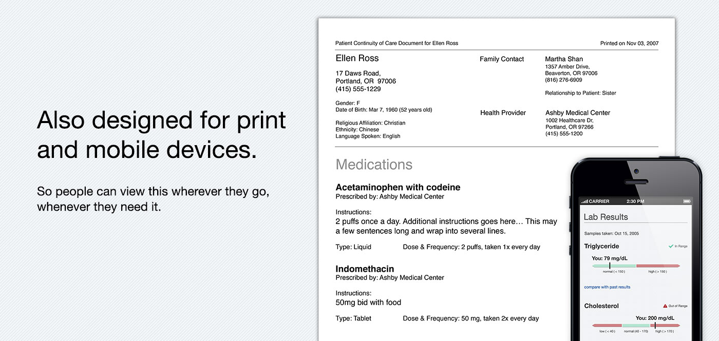
Other requirements: Account for possible visual impairment. Large, easy to read text with sufficient foreground to background contrast.
For Caregiver (secondary)
Goal: Get an overview of the patient's current health status, medicines they should be taking, allergies, upcoming doctor's appointments and things they can do to maintain/improve patient's health.
Other requirements: May be pressed for time. Use of size & colour to highlight important sections so it's easy to find what they need.
For Physicians & Pharmacist (tertiary)
Goal: Get a quick overview about the patient, their health status and past medical history.
Other requirements: Important info (Demographics & Contact) at the very top of document. Report is only to help identify areas that need extra attention, medical professionals should consult other reports when evaluating the patient.
Full breakdown of the design process can be found here: http://nnbox.ca/2012/11/health-design-challenge-approach-to-my-submission-part-i/
0 comments