
What a CCD should be
Design Rationale
General
Above all else, I wanted to keep the look and feel simple and clear.
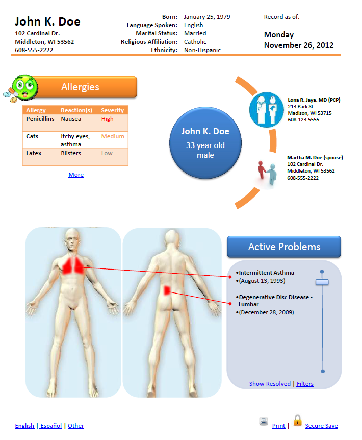
I felt that a visual reminder showing the patient at the center of the care team that includes not just the provider(s) but also family members was important. The idea here is that additional nodes could be dynamically added to the circle including pharmacists, therapists, dentists, etc.
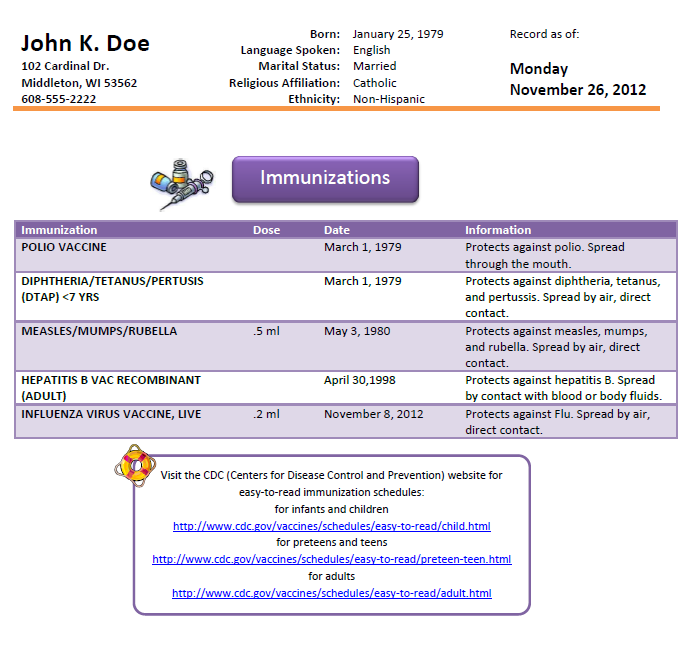
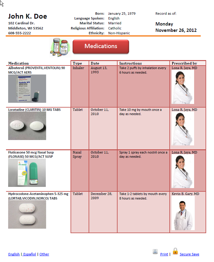
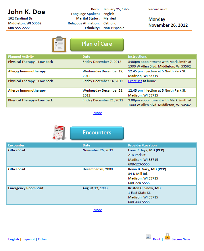
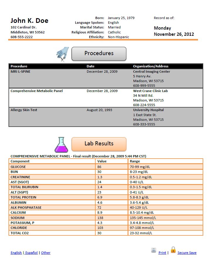
I included the patient demographic s and CCD generation date in the header of every page to ensure that the right information gets to the right person and stays with the right person.
My hope with the first page is that the reader would feel like he or she knows the patient’s basic story without trying very hard to find anything. In this case we know immediately that we are looking at a 33 year old male with lung and lower back problems and one severe drug allergy.
Space
I was fairly liberal with white space so that the most important information stands out instead of trying to cram as much information as possible onto a page. This presentation style attempts to avoid cognitive overload and it feels a bit more like what I would want to see as a patient.
I tried to maintain the concept of a page rather than having information flow continuously as it could with a pure website or mobile app. The design does include hyperlinks that could jump quickly to more information if the CCD is viewed on a device. Examples include low severity allergies, resolved problems, or plan of care activities with dates far into the future. This approach allows the first pages to include the most important information. When the CCD is printed, the additional information lives on later pages.
Icons/Pictures
In addition to bridging cultural and literacy gaps I think that visuals bring the CCD to life and entice the patient to read on. If I’m more likely to read something because I’m drawn to an image then I am more likely to be an engaged patient and take actions based on the information that I otherwise may not have taken. And isn’t it true that engaged patients lead to better outcomes at lower costs?
Although colors are used to make the document livelier, I never rely solely on color to communicate a key piece of information. For example, the allergy severity is color coded, but the words High, Medium and Low are still spelled out for readers that may be color blind.
Problem List
Wouldn’t it be cool for users on a device to slide the blue bar up and down and see different parts of the body light up based on a sliding chronological scale? Is there any intellectual property in that? Well anyway, I think that would be a great way for providers (and the patient) to review the problem list.
Dates
In an effort to support globalization and reduce confusion, I intentionally avoid the MM/DD/YYYY date format and spell out the month, day and year instead – trading off space for clarity.
Potential Issues/Concerns
•Does the design support longer names/descriptions?
Yes. Text size would be dynamic based on the number of characters.
•Wouldn’t the problem list component require a mapping of ICD/SNOMED to locations on the body?
Yes. But instead of thinking “what could be” I tried to think “what should be”. I believe Dr. Mostashari said something along those lines in one of his talks. Just trying to make the problem list more “Meaningful”.
•Are the icons/images licensed?
No. I just Googled images in most cases. These would need to be regenerated by a graphic designer so as not to get sued by WebMD etc. I did however make the red lungs and the lumbar disc images with drawing tools in MS Word (the extent of my artistic abilities).
•Is there any PHI in this sample?
No. The patient and provider information is all fabricated.
•Can this be implemented with HTML5, CSS, and JavaScript?
Yes. If there are objections, I know a guy in Austin that says he can do this with his eyes closed (ok maybe a bit of an exaggeration...but he is really good).
0 comments