
Color-Coded Simplicity At It's Best
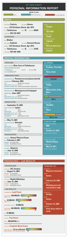
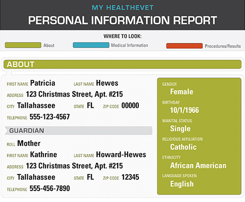
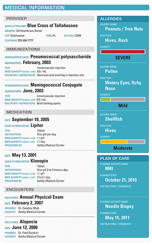
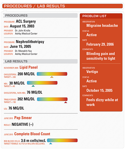
My goal with this design was to make it easy to read and follow by separating out major sections by color (intuitively), then creating a hierarchy of information within each of those sections. By including a color sidebar of important information (with diagrams of severity in some cases), it provides quick reference to to the reader. I also find that it's often easier to understand lab results when diagrams are used to show where you "fall" in regards to a high- or low-range test result, so I created "sliders" with a severity scale. Overall, I think this would be very easy for the vast majority of people to follow.
0 comments