
Content-centered Report with Smooth Visual Transitions
The report is intended to reduce eye strain for the reader. This is because the fields are displayed as gray text and only the content is presented in black text.
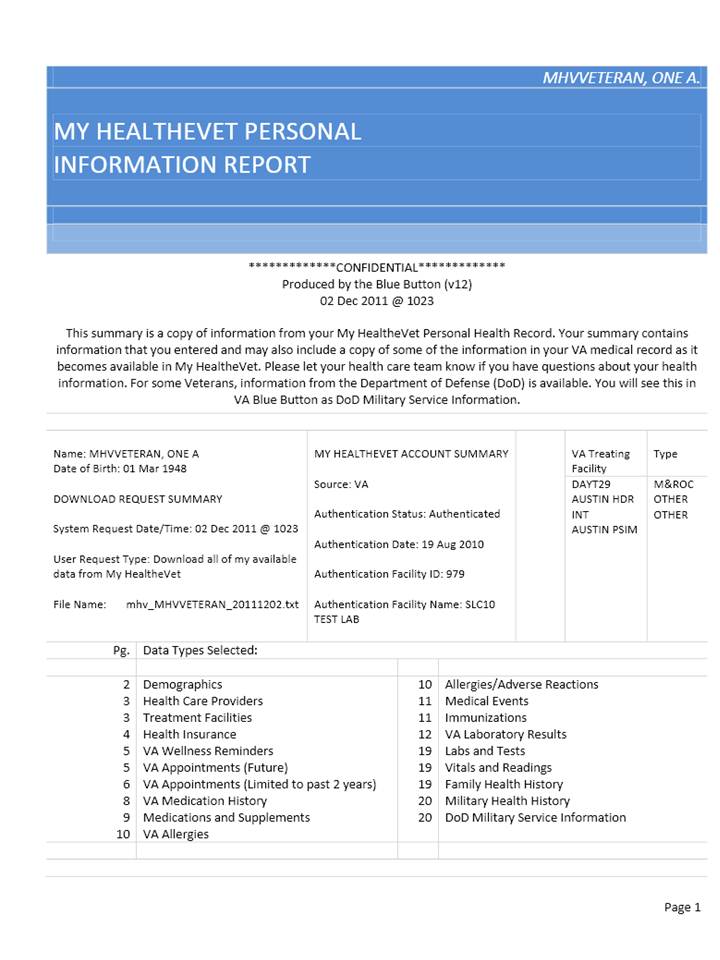
The table of contents at the beginning of the report enables the reader to quickly navigate to key sections of interest within the report.
White subject headings contrasted against black fields provide clear separators for the report sections.
New sections start immediately after previous sections end. This is nod to the ecologically-friendly users that look to conserve paper and make good use of the space on the document.
Light color accents can still be picked up as shade when photocopied on a black and white copier.
Light gray horizontal lines make the text appear to float off the page.
Inclusion of the patient's name in the top-right portion of the cover page allows for easy filing of the report.
0 comments